Art and Wellness: Zoom Webinar with the Frost Art Museum

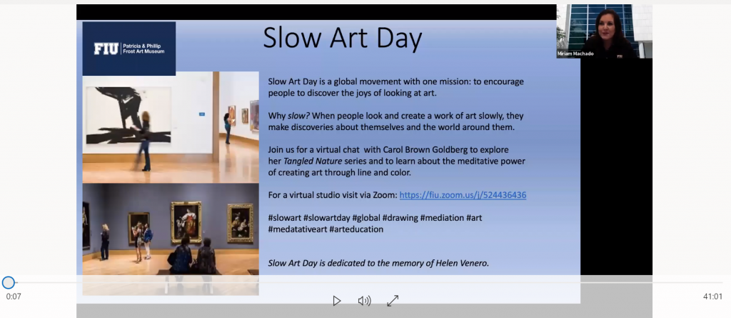
For their 8th Slow Art Day, The Patricia & Philip Frost Art Museum in Miami, FL, hosted a live webinar conversation focused on art and wellness with artist Carol Brown Goldberg, facilitated by Miriam Machado, Curator of Education at the Frost Art Museum (click on the image below to watch the webinar).

Slow Art Day Webinar: ‘A conversation with artist Carol Brown Goldberg on her series Tangled Nature and her exhibition at the Frost’. Screenshot: Johanna

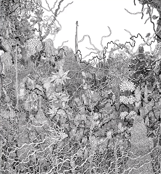
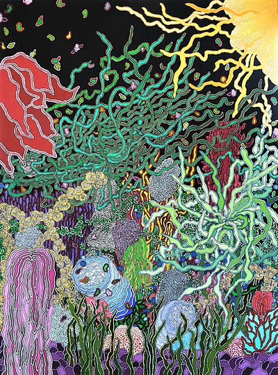
The conversation between Machado and Brown Goldberg was themed around “the meditative power of creating art through line and color”. Among other things, Brown Goldberg said that entangled lines can be seen as a metaphor for understanding our own lives. She illustrated her comments by using two of her artworks as examples: Extravagant Eden 8 (2015) and Maggie on My Mind (2015).

Carol Brown Goldberg, Extravagant Eden 8 (2015), Pen and Ink on Paper, 11 x 18 inches.
Carol Brown Goldberg, Maggie on My Mind (2015), Acrylic on Canvas, 79 x 58 inches

Viewers shared their own reflections and questions with Machado and posted comments on Florida International University’s (FIU) social media pages. When they were asked if the webinar was helpful in thinking about art and wellness, an impressive 96.15% responded “yes”.

Brown Goldberg said that many might come out of the current Covid19 lockdown with a renewed appreciation of the power of slow looking with art, including how it can impact overall health and wellness.

Though 18% of participants were from the FIU community (including professors, staff, and students), most were from out-of-state and even from a range of countries:

  • 39% from Florida
  • 37% from the Maryland/DC area (where the artist resides)
  • 21% from across the U.S. (CA, NJ, NY, MA, MN, VA)
  • 3% from outside the U.S. (Germany and the United Arab Emirates)

Further, an amazing 60% of the viewers had never visited the Frost Art Museum, which is a testament to how virtual webinars can bring new audiences to museums.

As Slow Art Day Blog Editor, I absolutely loved this webinar and the reflective dialogue between Machado and Brown Goldberg, and recommend it to anyone wishing to engage in a deeper reflection around art, wellness, science, color and lines.

All of us at Slow Art Day look forward to The Frost Art Museum’s 9th Slow Art Day in 2021.

– Johanna

“Curating in an attention deficit”

Todd Smith, Executive Director at the Tampa Museum of Art, recently filmed a video for the Tampa Bay Business Journal on what he’s observed as the change in how people view art. He compares the anachronistic way of focusing intently on one subject that is characteristic of his generation (“vertical” thinking) with the new wave of technologically-centred “horizontal” thinking. This brings to the fore a new challenge for art museums, like the Tampa Museum of Art, in how they educate visitors who are not accustomed to “vertical” or deep thinking. Smith poses the question “what does a museum experience look like, now and going forward for both my generation and older… and the younger generation?”

Smith sees this new way of thinking revolutionizing how museums curate their exhibitions, based on their observations of whether visitors take their time and look at works slowly or if they jump around and “make their own stories”. Smith foresees this adding another dimension to curating, in that “we’ll put the work up and tell our story, but we are interested in what the visitor is making of their own stories about the work,” essentially thinking of the visitor as the curator.

At Slow Art Day we, of course, advocate for a slow looking that fosters the “vertical” or deep thinking cited by Smith. Postulating the visitor as curator has the potential to foster a freer way of thinking that might lead to this kind of deeper, or “vertical”, way, vs. the merely “horizontal”. What do you think?

Host to Host: Rachel Matthews

[Hosts around the world are introducing themselves to each other in advance of Slow Art Day. Today we’re featuring some words from Rachel Matthews, the volunteer host at the Getty Center in West Los Angeles]

Hello fellow Slow Art hosts,

My name is Rachel Mathews and I will be hosting this year’s Slow Art Day at the Getty Center in West Los Angeles. This is my first year as a host, 4th year as a participant; I’m looking forward to being a part of Slow Art Day once again! While I’m not an art scholar, I do love viewing art and Slow Art Day is a great way to expand my art horizons. The Getty Center is a wonderful museum that has a wide variety of art, which makes it difficult to pick just 5 pieces; fortunately, I was able to get a friend to make the choices (we were originally supposed to co-host, but sadly, she’ll be out of town on Saturday).

I had an incredible experience the first year I attended Slow Art Day, at the Norton Simon Museum in Pasadena, that’s kept me coming back. A friend/co-worker was hosting and, in the viewing guide, there was a piece that I felt I was not going to enjoy. After I paid for my museum admission, I decided to head to the end of the furthest gallery and work my way back. As I walked, I spotted some of the other pieces in the viewing guide and made note where they were; suddenly, I saw a piece in the distance and was drawn to it – it was the piece I thought I wouldn’t like. But it was much larger than it looked in the guide (it ended up having an entire room to itself; I could see it about a gallery and a half away due to its size), which changed the experience completely. As I spent more and more time with this huge painting, I kept noticing more and more details about it and in it, which was intriguing. After spending 15 minutes with the piece, I absolutely loved it! After seeing all of the other pieces in the viewing guide, I decided that the first piece was my favorite. The following year, I went back to the same museum and made sure to spend time with it again.

One of my other friends wasn’t able to make the first 3 Slow Art Days, so I organized an interim Slow Art experience at the Getty last Fall for that friend and the friend who has hosted the previous Slow Art Days I attended. Since I don’t live near the Getty, I chose all of the artwork off of their website and wasn’t sure what my own reactions to the pieces I had selected would be, much less the impressions my 2 companions that day would have. I made sure to choose a couple of pieces that I wouldn’t normally be attracted to, hoping to re-enact that first year Slow Art attitude shift. Although we had to spend some time searching for the various pieces (which was part of the adventure), we all had a great time and, afterwards, had a very robust discussion about how the pieces impacted us.

I’m really looking forward to next Saturday. I wish everyone great success with their Slow Art Day events around the world!

Sincerely,
Rachel Mathews

[Make sure to check out (and register for!) Rachel’s Slow Art Day event at the Getty Centre in West Los Angeles]

Slowing Down at Museo MARCO

[Slow Art Day has asked its 2013 hosts and volunteers to write short summaries of their own experiences looking slowly at artworks of their choosing.]

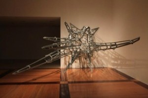
After looking around the Museo Marco, I chose the artwork The Fuck Off Project by Daniel Ruanova to examine patiently as part of the initiative of Slow Art Day. There were, no doubt, other pieces that called my attention, but the idea of examining this particular piece interested me the most. This artwork consists of a series of metallic rods that are assembled into a set of pointy extrusions. It almost looks like a “wire frame” (like those seen in animation programs) of the back of a porcupine.


Daniel Ruanova. The Fuck Off Project. 1976

At first glance the work certainly seemed aggressive. Although not insulting (at least until you read the title), I initially did not want to get near it. Each of the protrusions appear to be directed toward the viewer, independent of the viewing angle. Judging by the name, I thought that this was precisely the motive of the artist – i.e. to portray aggression.  That made me think of similar shaped things in nature that convey the exact same defensive idea, like pufferfish or the porcupine, and I concluded that the artist may have been inspired by such animals.

Despite my apprehension, I decided to slowly approach the piece. As I got nearer, I noticed that the feeling of aggression became stronger.  I decided to actually walk into it and that changed my experience of the piece completely. There, inside it, I felt protected. The metallic arms were no longer pointed towards me but towards everyone else. It’s as if now their sole purpose was my defense. I sat down to be able to immerse myself deeper, and, as expected, the sense of security was intensified. There, in the midst of all those metal rods, I felt comfortable.

The next thing I noticed was the facial expressions of the people in the museum when they noticed me there. Assuming they shared the feeling I had felt while looking at the sculpture from the outside, I could understand why. I sat there for awhile, watching people pass looking bewildered.

I now understand the Slow Art Day initiative in a better way and can see how slow looking can really transform the experience.  Looking slowly and taking the time to move in and around this artwork completely changed my perception – and – this insightful episode reaffirmed my decision to be a host during the Slow Art Day for Museo Marco in Monterrey on April 27.

– David Zambrano Reyes, Volunteer at MARCO

[Make sure to check out Museo MARCO’s Slow Art Day event in Monterrey, Mexico.]

Take a Slow Look, Canada

Slow Art Day has asked its 2013 hosts and volunteers to write short summaries of their own experiences looking slowly at artworks of their choosing.

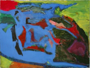
The day of my assignment, I strode into the gallery with purpose; J.E.H. MacDonald’s October Shower Gleam, 1922, was the only work I was going to spend time with that day.  This work did not initially outwardly appeal to me – I felt like I was up for a challenge to see what it would be like to look at it slowly.

J.E.H. MacDonald, October Shower Gleam, 1922. Image courtesy of WikiPaintings.

I set my alarm for the proscribed 10 minutes, and set my eyes (and mind) to work. What initially made the painting unattractive to me, the garish 70s mix of close-to-neon colours with earthy greens and browns, I set my eye to first. Looking closely at what I read as autumnal trees and brush, I soon discovered a graceful patterning of organic shapes in the entirely unnatural colours of bright pink and teal, outlined in ultramarine blue, with a ground of gessoed and textured canvas showing through. As my eye traveled downwards, towards the reflection of the landscape in the still lake, I realized that MacDonald’s depiction of water consisted solely of a reflection of the patterning I had been closely studying.

What I read as “water”, in fact, didn’t contain something normally characteristic in depictions of water; namely the colour blue. MacDonald actually had painted a ground of light orange onto which he had then transcribed his reflected scenery. Sandwiching this mirrored landscape was a mass of roiling clouds, done in wavy lines of lavender and deep purple, as well as a rocky outcropping of land containing a few windswept trees in the foreground. They squished me into the landscape in such a way that I felt like my only escape was forward, toward the rolling hills and the two small “V’s” of clear sky – away from the October shower that was imminent, seen in the shiny wetness of the purple clouds.

My “introduction” to the work lasted a mere minute or two. After that, I was lost in the landscape, its patterns, shapes, colours, and texture, until my alarm rudely interrupted. Ten minutes felt like two; I could have easily spent another ten or twenty minutes immersed in the work.

Though not initially appealing to me, I grew, through this exercise, to appreciate aspects of the work that weren’t immediately apparent. Practicing slow looking with a work I wasn’t immediately attracted to in a positive way helped me remember that to “like” and “dislike” are fluid categories (and don’t always include “appreciate”). I was also reminded not to always take other people’s word for it – it is always more rewarding to see for yourself.

-Tori McNish, Slow Art Day volunteer

The Art of Looking with Vermeer’s “Girl”

Slow Art Day has asked its 2013 college interns to write short summaries of their own experiences looking slowly at artworks of their choosing.

Few paintings possess the same level of fame as Johannes Vermeer’s Girl with a Pearl Earring. Who was the enigmatic girl in the painting? What was her relationship to the artist? Why did he paint her wearing such a large and distinctive pearl earring? Art historians have speculated tirelessly on the answers to the questions, and the level of mystery surrounding the Girl has led her to be labelled “the Dutch Mona Lisa.”

Given all this, it’s next to impossible to not be aware of Girl with a Pearl EarringThe last time I did a slow art viewing experiment, with Jay DeFeo’s piece The Rose, I had only a passing familiarity with DeFeo and her work. But Girl is an inescapable piece, so when I viewed the painting at the de Young Museum’s special exhibition Girl with a Pearl Earring: Dutch Paintings from the Mauritshuis, it turned out be a completely different viewing experience.

Girl is obviously the star of the exhibition. She appears on all of the de Young’s promotional material for the exhibition, and her face is currently plastered on the side of every bus in San Francisco. Before I even walked into the exhibition I’d seen her face many times over the past few weeks, and was, frankly, a little sick of her. But as any art lover will tell you, seeing a reproduction of a work pales in comparison to seeing the work in person.

Jan Vermeer, Girl with a Pearl Earring (detail), 1665. Image courtesy of the de Young Museum.

The painting’s placement in the exhibition reinforces its central importance. The exhibition spans five rooms of the gallery, all of which are densely packed with paintings, with the notable exception being the room that houses Girl with a Pearl Earring. The room’s only occupant, the Girl confronts you head-on, visible even from the preceding gallery. The painting’s dimensions are rather underwhelming in person, something that the curators and installers cleverly disguised by shining bright lights on the painting and shrouding the rest of the room in darkness. An otherworldly glow seems to emanate the canvas.

When conducting slow art viewings, I like to view the artwork from as many different angles as possible – far away, up close, from the sides. However, I quickly discovered that this is difficult with a painting as diminutive as Girl with a Pearl Earring. I could barely see it when trying to view it from across the gallery; I just got an impression of large blocks of bright colors, an impression that was validated when I moved closer. One of the things that struck me was how sparingly Vermeer used different shades of pigment. Although the painting seems rich in color, and it certainly is, relatively few different shades of color are used in the painting. It seems almost minimalistic – although this isn’t something we generally associate with the Dutch Golden Age, I was reminded of the sparsity of different color shades used in abstract paintings by Mondrian or Rothko.

However, after spending several minutes in front of the piece, I did start to notice several subtle but startling uses of color. There is a small dot of white paint at the corner of the Girl’s mouth that echoes the white dots in her pupils. Her lips appear at first glance to have been painted bright red, but upon closer examination actually contain traces of black, gray, white, and even blue pigment. Even though her pearl earring is the painting’s brightest focal point, it is actually painted almost entirely in black and gray, with just one small white brushstroke that lends it a luminous, glowing quality amidst the darkness of the surrounding canvas.

I realized at the end of my slow viewing experience that the work, which seemed so diminutive at first glance, seemed to have taken on greater proportions. After looking at each individual detail of the painting at great length, the whole of the painting had become much larger than the sum of its parts. The work is only one and a half feet high, but it feels monumental and, at the same time, intimate, as if she is looking at you alone. If you are in San Francisco, I highly recommend that you make the effort to go see this painting (and the rest of the exhibition). You may think you’ve seen it already, on postcards, book covers, and other reproductions, but when you see it in person you will realize that until that moment you’ve been mistaken.

– Maggie Freeman, Mills College

Jan Vermeer’s Girl with a Pearl Earring (ca. 1665) was viewed at the special exhibition Girl with a Pearl Earring: Dutch Paintings from the Mauritshuis at the de Young Museum in San Francisco, CA]
Lost in the Galapagos: Looking Slowly with Michael Bogin

Slow Art Day has asked its 2013 college interns to write short summaries of their own experiences looking slowly at artworks of their choosing.

Last week I decided to spend some time looking at the work of Michael Bogin at the Davis Gallery here on my school campus.

After wandering the rooms of the gallery, scanning the walls in search of one of Bogin’s pieces that speaks to me, I notice a pattern. While at first seeming overtly simplistic, upon closer inspection his pieces start to formulate individual stories. Scanning the room, I am immediately struck by the stunning color schemes that run across the walls. His use of color varies in each piece despite their overall similar structure and as the works progress, a tale forms.

Upon closely looking at Galapagos #157, its shapes come to life and a story emerges. A koi fish whizzes past with a mermaid trailing behind; an underwater flower opens its blossom to say a few words; fish of every size decide to come investigate the scene; a coral reef arises from the abyss; bubbles float to the surface like fizz; and light begins to reflect off the ocean’s crystalline surface.

As I continue looking, I realize that I have just reached the Ecuador archipelago. As I gaze into the depths of the Pacific, I see something dart by. With the face of a woman and the tail of a fish I deem her a mermaid. Here things get strange. I fall into a kind of dreamlike state and the creatures gain the gift of gab. The koi fish tells me of the mermaid’s high status amongst the sea creatures as the mermaid playfully chases him away. The coral reef begins to tell me of her tremendous beauty and suddenly the fish that reside in the reef come out to confirm her allure. The sudden commotion causes water bubbles to lift to the surface and as the bright reflection of the water hits my eyes, I snap out of my delusion and once again I am standing in the gallery.

The process of slowly looking at Bogin’s painting proved a surprising experience. The more I look, the more I see. I now notice Bogin’s use of color and forms. The piece now opens up to me in a different way and I begin to see the intricacies of what Bogin has created.

Done in gouache, watercolor, and colored pencil, the multi-medium quality gives the piece a depth that mimics that of the ocean. Looking at the center of the painting, it becomes difficult to tell if the water sits in the foreground or background. The sea creatures seem to remain in limbo undulating back and forth between the different layers of the painting and it is this confusion that leads to my intrigue. The more I look at the painting, the less sure I am of where all the shapes sit in space. The reds and oranges seem to float to the surface in some areas while they seem to recede into the cloudy blue expanse in other sections. After a while I begin to see the intentionality behind Bogin’s every mark. I can see, upon closer inspection, where he has laid down a block of color, taken most of it away, and then put down more paint in order to achieve the illusion of depth. The blues overlap the greens in the top portion and leave behind a shadow of what once was, thereby furthering the magic of his artifice. It is this ambiguity that endows the painting with such power.

There seems to be an extreme intentionality that lies behind every mark in the painting. Simple shapes are transformed into sea life with Bogin’s poignant mark making and the scene comes alive with his innovative use of overlapping color. While there is a broad expanse of green and purple shapes conglomerated on the right side of the painting, this mass is offset with the smaller blocks of reds and greens that sit at the center of the scene. A large stretch of blue evolves into ocean in the areas where the watercolor pools into dark waves of indigo. Color merges and submerges in a playful coalition of paint and story. Just as your eye begins to follow a stream of red, you are pushed into a puddle of green; and just as you begin to circle around the green, your eye is slung into the neighboring pool of purple. This diversity of shape and color employed by Bogin is what gives the painting such life and allowed me to conjure up a story while exploring the piece’s nuances.

Had I left the gallery after a brief browse, I would not have taken notice of the intention that lies within Bogin’s work. I would not have formed the connection to the painting that still remains. The practice of looking slowly at art requires no expert nor expertise; art speaks and I learned again that if I am willing to slow down and listen, then I will hear its story in all its dimensions.

Mary Nyiri, Hobart and William Smith

[Michael Bogin’s Galapagos #157 (2009) was viewed at the Davis Gallery at Hobart and William Smith in Geneva, NY]

Viewing Art, Being Present

From time to time, we post short articles from Slow Art Day hosts. The article below is by veteran Slow Art Day host, Paul Langton.

A rainy day. I am early for an appointment. An opportunity to go to a gallery for forty or fifty minutes, without expectations? I realise don’t actually know what is currently on at the gallery.

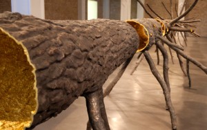
Fortunately I listen to my intuitive self, and a few moments later find myself in the Whitechapel Gallery, exploring Mel Bochner’s fascinating work. But, I become aware that his exhibition would need more time than I feel I can allow. I then go into a room with a single sculpture. A tree. Immediately fascinated I walk around the sculpture. I notice the materials used – gold leaf, bronze. I feel at home in the space and decide to spend some time in this room.

Spazio di Luce by Giuseppe Penone at the Whitechapel Gallery (image from the Whitechapel Gallery website – click the image to visit)

A well-placed bench allows for some slow art thinking. Who is this by? What is it doing here? I walk around, I sit down. I walk around again. I go and read the information about the sculpture. I ask the attendant if I can I touch it.

The exhibition is very peaceful. Occasionally people come in and I notice their reactions to the piece, yet I am pre-occupied by my own thoughts. I feel I am in the right place at the right time, as though I was meant to see this piece today. I love the way each time I view the tree it look different and I love the light further illuminating the gold leaf, shining light on this wintry day. I walk alongside it and see it from different angles. I don’t hug but I do touch.

The sculpture, I find out, is Spazio di Luce (Space of Light) by the Italian artist Giuseppe Penone and is a Bloomberg Commission, in the Whitechpael Gallery until September 2013. Space and light, they seem ideal words. It’s good to find out it will be here for a few months, and another visit will be possible. I realise I may have seen some of Penone’s work before as part of Arte Povera at Tate Modern, but I couldn’t be specific.

I have been thinking of trees in the last few weeks and the importance of trees – there was a fascinating discussion on the radio the previous month about trees with James Aldred and Mark Tully – and this sculpture adds an extra dimension to my current feelings and thoughts. I reflect on nature, art, myself, others, and art as part of life.

The light in the title becomes so appropriate as I leave the gallery, literally feeling lightened and uplifted. I then wonder on how something so beautiful and fascinating just appeared in my day without notice. In my head I thank the artist and the gallery, for being presented with and for being present, for some time, with this wonderful sculpture. Please visit if you can.

(If you are not able to visit a video of the artist talking about the work is on line: http://www.whitechapelgallery.org/exhibitions/the-bloomberg-commission-giuseppe-penone-spazio-di-luce).

The Whitechapel Gallery is one of 160+ Slow Art Day venues for 2013. Click here to find out more or register.

– Paul Langton

Note: An earlier version of this piece first appeared in Paul’s blog: http://artsandmoresw4.wordpress.com    

Connecting the Dots: Slow Looking with Roy Lichtenstein

Slow Art Day has asked its 2013 college interns to write short summaries of their own experiences looking slowly at artworks of their choosing.

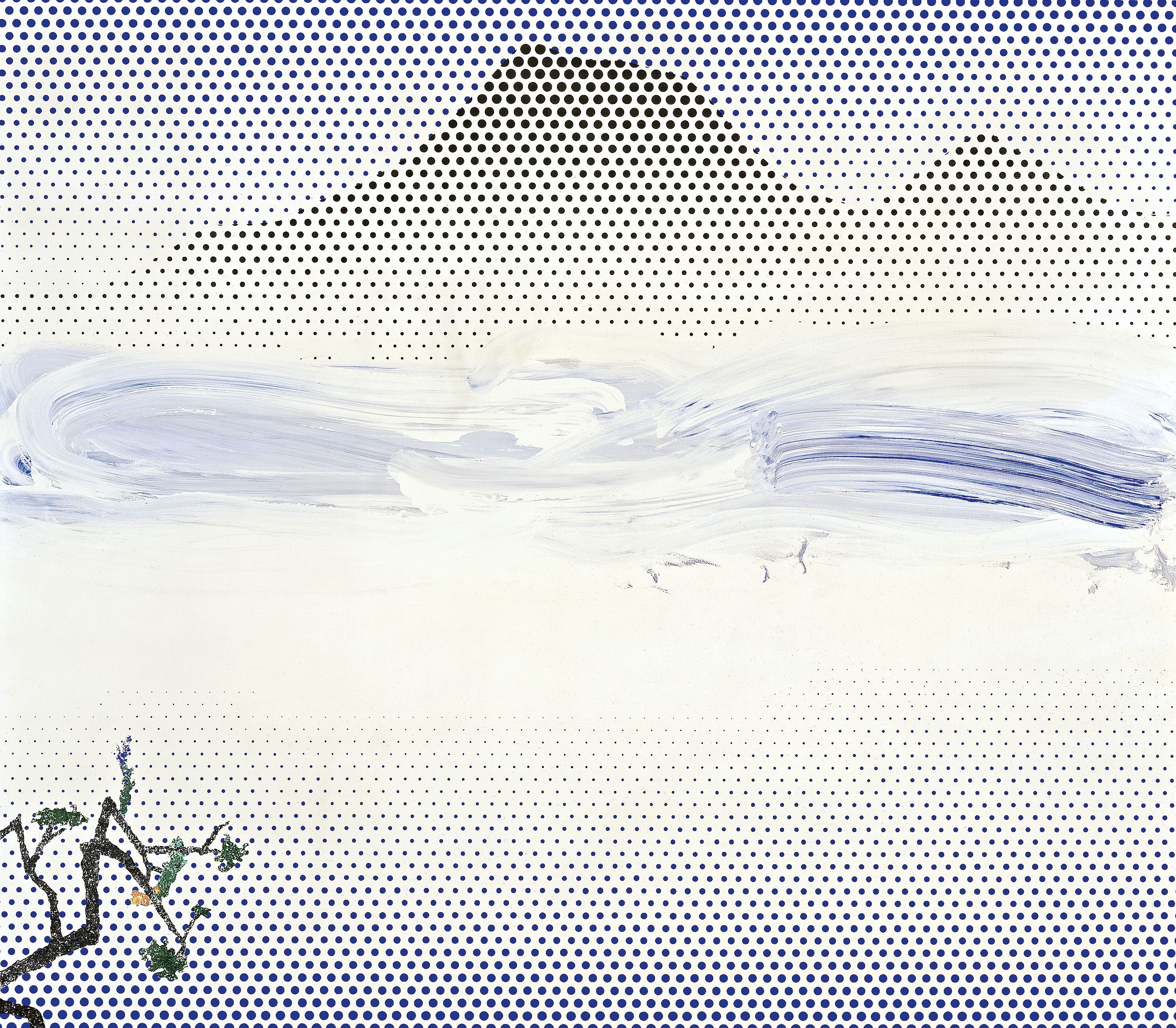
While spending some time at home in Virginia over the holidays, I headed into Washington DC to check out the National Gallery of Art’s retrospective of Roy Lichtenstein, one of my favorite artists. Lichtenstein’s mechanical, removed style has always intrigued me, as most of his paintings are void of any painterly brushstrokes. The retrospective was truly spectacular, displaying not only Lichtenstein’s cartoon style, but also some truly stunning landscape paintings made near the end of his life. These landscapes managed to combine Lichtenstein’s trademark ben day dots with traditional Chinese landscape painting, two styles I wouldn’t have expected to mesh well together.  I had never seen these works before, and spent over 10 minutes in front of this painting, Landscape in Fog, created in 1996, a year before Lichtenstein’s death.


Roy Lichtenstein, Landscape in Fog, 1996, Oil and Magna on canvas, 71 x 81 3/4 inches (180.3 x 207.6 cm).

Both painterly and mechanical, this late, almost minimalistic work seems to layer dots behind and under a more abstract expressionist brushstroke. Looking at the ben day dots receding into the white background towards the center of the canvas was difficult on the eyes; it was almost impossible to tell whether the dots were covered by the white background, or whether Lichtenstein’s virtuosity with circles produced a gradient effect. Looking at the dots up close was mesmerizing; each dot is painted individually, and the subtle flaws in the imperfect circles reminded you that the artist painstakingly filled in, by hand, every single dot. The black dots used to give the effect of mountains were equally as fascinating, as Lichtenstein included slivers of individual dots to help define the outline of the mountain peaks.

Without careful observation and slow looking, these incredible details would have been lost. Not only did I get to see a series of paintings that I had no idea even existed, I interacted with this piece in a way that helped increase my awe and fascination with Lichtenstein. As I spent more time than the other visitors in front of this piece, I felt almost a kinship with Lichtenstein, who must have taken ages to carefully paint in each individual dot; the art of slow looking connected the artist and the viewer in a meaningful way that I won’t soon forget.

Alie Cline, University of Texas at Austin
Slow Art Day Social Media Manager

[Roy Lichtenstein’s Landscape in Fog (1996) was viewed at the National Gallery of Art in Washington DC at the exhibition: Roy Lichtenstein: A Retrospective.]

Turin Point: My Face-off with Franz Kline

Slow Art Day has asked its 2013 college interns to write short summaries of their own experiences looking slowly at artworks of their choosing.

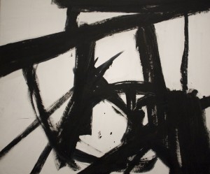
Meandering the sparsely populated gallery on a normal Tuesday afternoon, it is nearly impossible to not be transfixed towards Franz Kline’s Turin (1960). As I draw closer to the magnetic canvas, it’s massive presence causes Turin to loom over, dwarfing me with impressive size. My first instinct in the face of such a monolithic painting is to scatter to any corner of the exhibit. Instead, I decide to stand my ground in the front of the gallery. This bolstering of will initiated by the intimidating strokes anchors my legs directly in front of the canvas. Perhaps my initial reaction can be distilled with a measured and slow look.

Within the first minute I am already wavering.  The raw, impressive energy of Turin is overwhelming head on. I am used to standing off on the side, not facing a work so directly. I cannot afford to be passive, however, I have to engage with what I am staring down before me. Instead of an impartial sweeping glance across the room, I find myself fixated. Here, I am held captive.

I am drawn first towards the thick, heavy vortex of black paint. All I see is black, as my eyes are downcast towards the frenetic yet firm grip of the brushstrokes. The distracting murmurs of the gallery’s other inhabitants echoing in the spacious gallery begin to dissipate. As far as I am concerned, I am in solitude with Turin.

I become more preoccupied with trying to discern how brooding columns of pigment can pair so well with fibrous sweeping gestures. I follow the strong, deliberate beams outward until I must step back and shift my weight in order to follow their lead. As the concentrated black swirl leads out in angular, cantilevered bars, I exit the vortex that had first captured me, my eyes watching the articulate arching reaching outward. I soon realize that Turin, in fact, has an abundance of white space.

By standing my ground, I have the revelation that Turin exists in a state of contradictions. It appears both dark and light, crowded and sparse, belabored and spontaneous. I realize that there is a wealth of information behind it’s initial intimidating stature. With this reveal, it becomes obvious that Kline’s abstraction is a well-crafted process revealing a plethora of competing elements.

I step away with satisfaction, having spent a good deal of time exploring the varied and numbered passageways within Turin. Without stopping and looking unflinchingly at the canvas, I doubt I would have been able to fully appreciate Turin’s dynamism, or been able to see the fluidity in his taut lines.

-Karen Trop, Bennington College


[Franz Kline’s Turin (1960) was viewed at the Allentown Art Museum’s exhibition: Franz Kline: Coal and Steel. The Allentown Art Museum is a participating venue for Slow Art Day in 2013.]